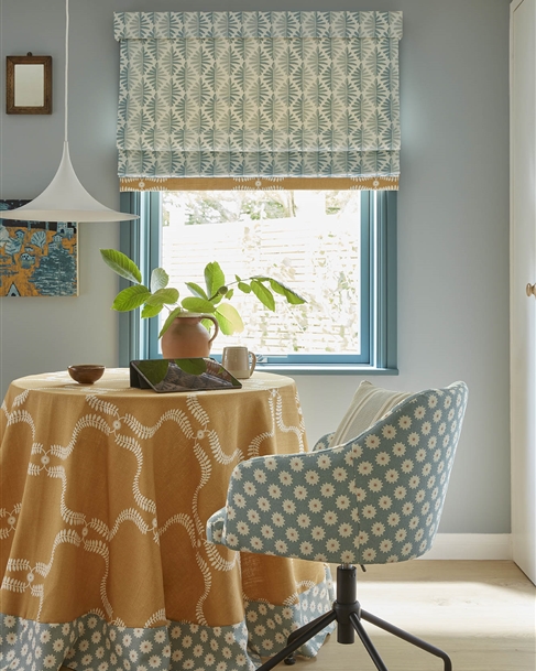
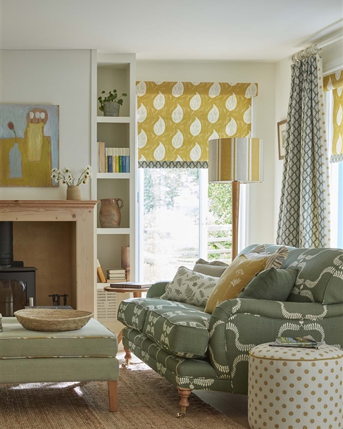
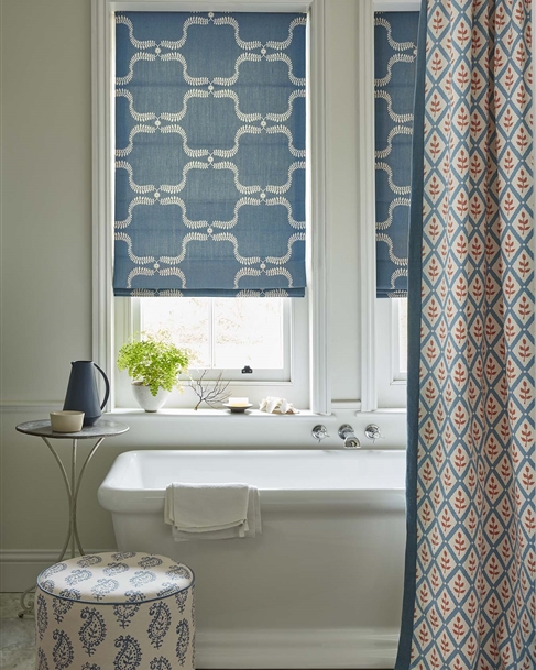
Made to Measure Red Roman Blinds
Is red a good choice for Roman Blinds?
When people walk into a red room, they immediately respond. High-octane orange-tinted tones make you feel energized and alive, while subtler, more old-fashioned purplish shades―burgundy, maroon, brick―can evoke the cosy, insular vibe of, say, an 18th-century library. Either way, red is a statement colour. Read More...
Help & More
Get 5 Free Samples
Additional samples are £1 each. £2.00 P&P for UK residents.
Returnable Sample
Buy half a metre of fabric which is refunded on return within 30 days in good condition
Let's get started by selecting your fabric…

Made to Measure Roman Blinds
Is red a good choice for Roman Blinds?
When people walk into a red room, they immediately respond. High-octane orange-tinted tones make you feel energized and alive, while subtler, more old-fashioned purplish shades―burgundy, maroon, brick―can evoke the cosy, insular vibe of, say, an 18th-century library. Either way, red is a statement colour.
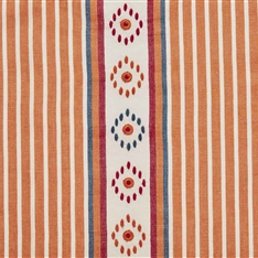
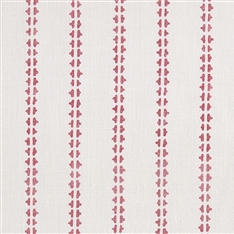
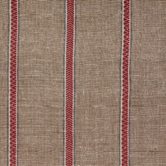
Even a small quantity of red on a Roman Blind may breathe new life into a room with an otherwise neutral colour scheme. Tomato, the brightest red fabric, is used in the Wild and Free, Life and Eternity Detail, Little Fern, and Stockholm Stripe designs. This colour can be used to create stunning red soft furnishings and furniture.
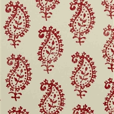
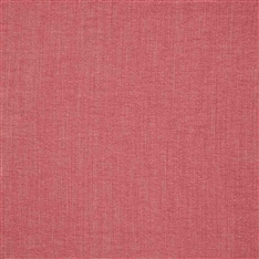
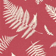
Raspberry red is softer and a little more orange, making wonderful red upholstery fabrics or red curtain and blind fabric. See our designs Fern and Dragonfly, Little Leaf, and Botanical Trellis.
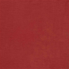
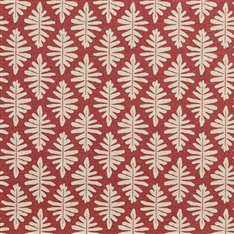
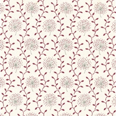
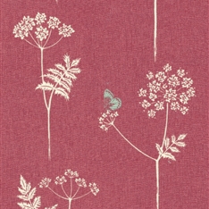
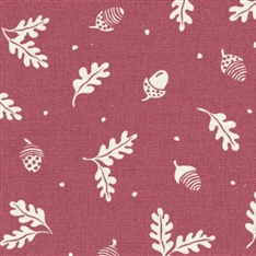
The Cranberry red fabrics have more blue in them and go more towards a burgundy dark red upholstery fabric. Cow Parsley and Acorn and Leaf both have this lovely mellow red, warming up a room without being too strident.
Red soft furnishing fabrics are warm, cool greys and warm blues are also possible complementary colours to use in a room to add interest.
Red stimulates the appetite, which makes it a perfect choice for the lead colour in a dining room palette. Any of our red fabrics would work in this type of room, but maybe especially the Cranberry in Acorn and Leaf, Cow Parsley, and Dandelion Trellis. Red adds drama to any room—even one as utilitarian as the kitchen. Paintings, accessories, lampshades, and even carpet rugs and runners are more ways to incorporate this vibrant colour into a space. I sell hand-woven carpets and floor/stair runners in the colour Cranberry from a woollen mill in Pembrokeshire, which is a wonderful accent to any home in need of an extra-warm hue.
What colours contrast and complement red well?
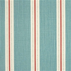
If you’re familiar with the colour wheel, you know that green is exactly opposite of red, making it a complementary colour. Complementary colours tend to, well, complement each other, so green is a great choice to pair with reds. See fresh Apple Green mixed with Raspberry red in Down to Earth, Stripe and Dash, and Paisley Ground designs.
A colour scheme of red, white, black, and grey make a stylish bedroom. Red punctuates the room with pillows, a throw, a rug, and other accents. If you’re not ready to commit wholly, try red as an accent, pulling it in through curtains, cushions or an upholstered chair. Decorating tip: in a sitting room, pick a wall colour—like chocolate brown—to ground the red. Because the colour is so visually arresting, even one red upholstered chair or red cushion can transform a neutral room. Red furnishings work well with pale and dark neutrals―white walls, wood floors, and natural stone.
These fabrics are all suitable for soft furnishings and furniture, which we can with our Made to Measure service.
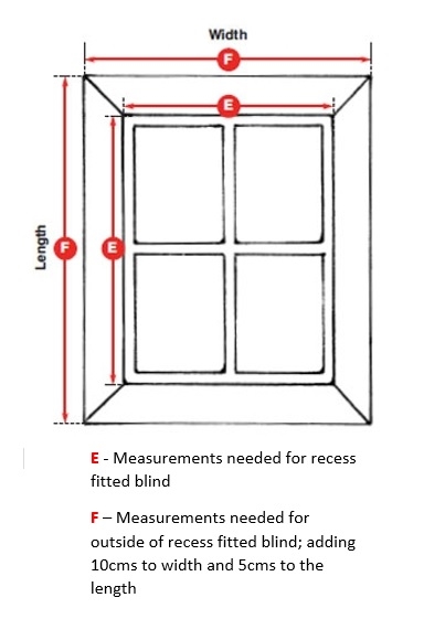
HOW TO MEASURE UP FOR YOUR ROMAN BLINDS
INSIDE A WINDOW RECESS
Width: Measure across the recess at several points and give the narrowest measurement minus 1cm for clearance so the blind will run freely (see E on the diagram)
Length: Measure from the top of the recess to the bottom (see E on the diagram)
OUTSIDE A WINDOW RECESS
Width: Measure the width of the recess and add at least 5cms on each side for overlapping (see F on the diagram)
Length: Measure from the required starting position above the window to the length you require, adding 5cms on the length