
Botanical Collection – behind the scenes
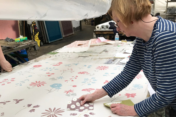
Feature image: Sampling my Botanical Collection at the printers. These sample lengths are fresh off the printing tables, quick decisions have to be made to tweak colours and printing pressures to achieve the right balance…and new samples asked for. We then go back to the printing machines to create some new samples having altered the colours and sometimes also made changes to the squeegee pressures. The squeegee is the blade that spreads the dye over the silk screen. With increased pressure it pushes the dyes through the mesh of the screen with more force making stronger marks and vica versa. We are constantly checking colours against ‘masters’ to make sure all the Hays or the Field Greens for instance, match across all my fabrics.
Behind the Scenes
I thought I would share with you the journey of designing a new collection of fabrics. Inspiration comes from many places…a workshop, an exhibition, museum visit or even a painting or a greetings card.
For this collection I started by talking to my wonderful team: Hayley, Sam, Clair, Tammy, Izzy and Kelly, to find out the type of fabrics and colours the customers are asking for that we don’t already have. The over-riding request was for a large scale, multi coloured, traditional floral design to link my one colour prints together. So flowers it was…
Back at home I hunted for a favourite book of beautiful botanical illustrations and also walked around my garden, looking in the hedgerows to collect flowers and foliage.
The next part of the process, often the most difficult, I had to make myself sit still and draw. I placed a table near a window with lovely light and a wall to pin up sketches and ideas. This is when I need to get into ‘flow’…the space when you forget time and what’s going on around you: a very creative and restful place. So switching from the analytical side of my brain to the creative side is what’s needed…no more spreadsheets for a while!
I then took my designs and drawings to a wonderful colleague I have worked with for years who scans them onto her computer and from there we play with scale and pattern making.
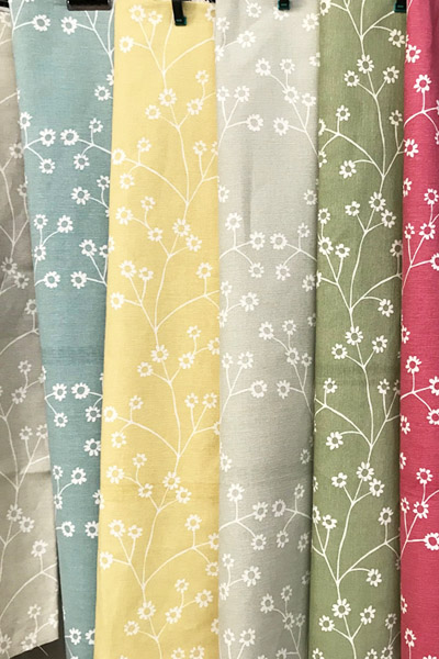
At the end of the process, when I thought I had finished, we decided to cut each flower out of lino and print them onto paper, in order to create softer shapes and lines. A lino printed image has more texture (shades of colour and different marks) in it and hence more interest. The supporting design, Dainty Daisy, has flower sprigs that stand alone, repeated it in simple ‘art deco looking’ pattern.
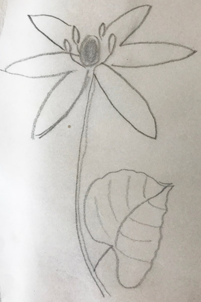
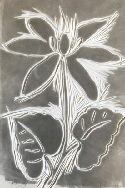
Left: My simple pencil drawing on tracing paper, so I can layer other flowers on top and beneath. Right: Beginning to cut the same flower from lino, to print to give softer and more interesting lines for the flowers.
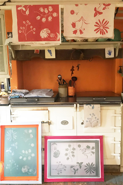
Small trial screens drying in my kitchen…
The delicious process of exploring colours, I could have gone on for ever…
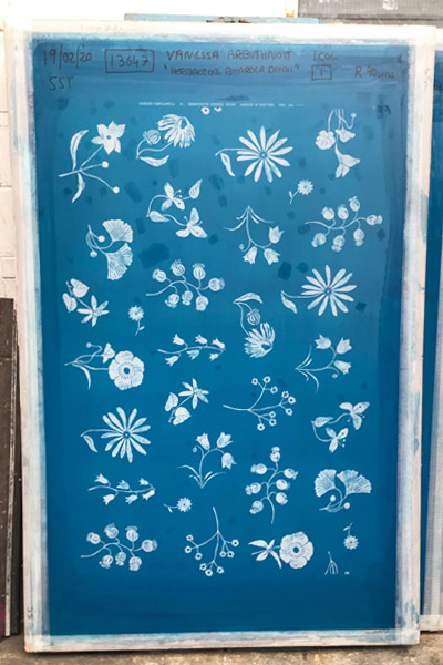
The next stage for me, was to make a small silk screens (see above in my kitchen), enabling me to look closely at the marks I have created, tweak them if necessary and trial colours.
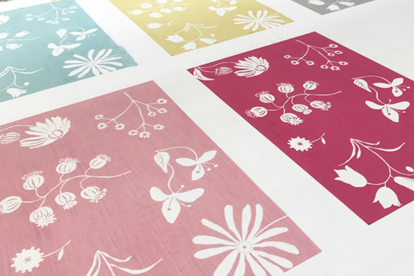
Finally the art work is sent to my printer who makes large silk screens or rotary screens depending on the design and sampling starts. We probably try about 100 colourways and end up choosing about 20. During this process I work with the printing team for about 2 weeks, sampling, selecting the best and then printing the first stock.
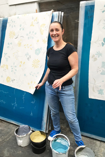
My amazing helper Laura at the printers with me trying out colours for all the flowers, making sure they are all in balance, if one colour is too strong it would dominate and catch your eye too much.
Checking all the colours are right in this multi-coloured design.
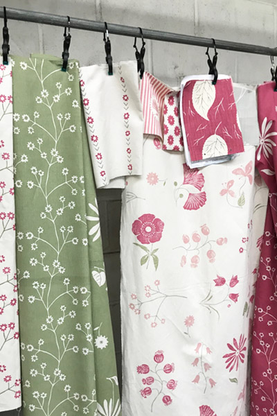
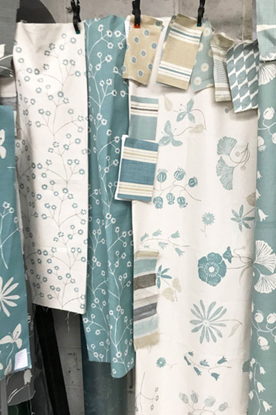
Trying to work out a balance of prints with cream backgrounds and ones with coloured backgrounds. If you use the large Herbaceous Border Detail for your curtains, you will need a fabric with a coloured background for your window seat, upholstery, or cushions etc. Green and Pink are just so right together.
Here are the different types of curtains we offer.
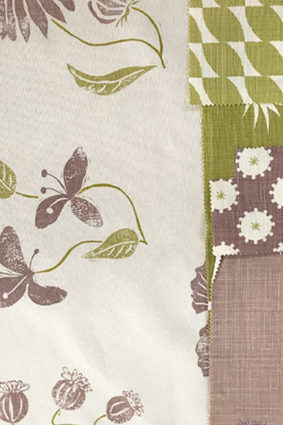
Colour matching is so important and here I can see that these Damson and Clay prints can be used together very happily.
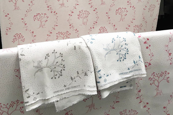
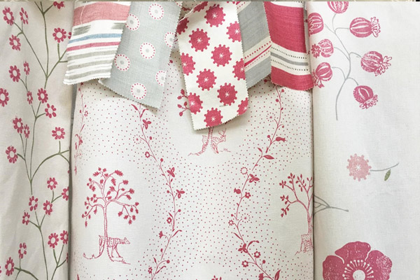
Fallow Deer slipped into this collection because it is also nostalgic and traditional, the perfect fabric for a bedroom or elegant sitting room. I took this design to Jaipur a few years ago and watched as wooden blocks were cut and printed; we scanned these print marks and recreated the design using silk screens.
We sell fabrics exclusively designed by Vanessa Arbuthnott, along side small, bespoke collection of Made to Measure items which includes curtains, blinds, sofas, footstools, chairs, headboards, and quilts, all handmade specially for you by master crafts people.