
5 Ways to Bring the Colours of Summer into Your Home
Close your eyes and picture a sunny summer afternoon in the English countryside. Hedgerows fill with cow parsley, wildflower meadows burst into colour, and woodland paths are softened by ferns and dappled light. Now imagine bringing that vibrancy into your home.
A good summer colour palette for interiors can help you create a much lighter, brighter atmosphere. Introducing a few summery fabrics is the easiest way to refresh your home without committing to a full redecoration.
Whether you’re drawn to warm earthy tones or fresh coastal hues, here are five beautiful ways to bring the colours of summer into your home.
1) Embrace warm terracotta and golden ochre
Terracotta and ochre bring the warmth of Mediterranean landscapes and long summer evenings into your home. Terracotta’s richness sits comfortably alongside softer ochre accents to create a scheme that feels welcoming and grounded rather than fleeting. These sun-drenches shades work beautifully in living rooms, kitchens, and garden-facing spaces, adding depth without ever feeling heavy.
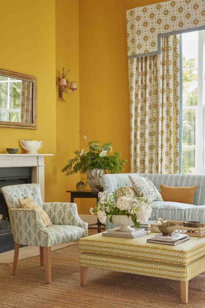
How to bring these shades into your home:
Try introducing these warm tones through some scatter cushions, Roman blinds, or statement curtains.
Pairs beautifully with:
Natural wood, woven textures, and linen-rich fabrics for a relaxed summer look.
Our bestselling terracotta and ochre fabrics:
Wild Fern in Peach, May Blossom in Light Peach & Charcoal, and Dotty Check in Soft Ochre, Ochre & Smoke.
2) Create a coastal retreat with blues and sandy neutrals
Want to spend your summer feeling like you’re on holiday by the water? Soft sea, sky blues, and weathered navy tones pair wonderfully with sandy neutrals, helping to create a calm and airy atmosphere that feels reminiscent of the seaside. Layering these tones gives you a scheme that feels elegant rather than overtly nautical. This palette works particularly well in bedrooms, sitting rooms, and any space where you want to relax during the warmer months.
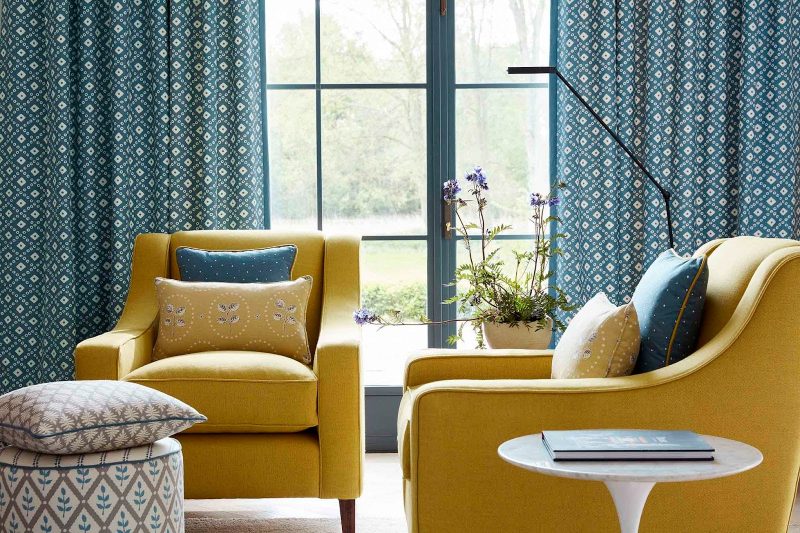
How to bring these shades into your home:
Opt for light-filtering curtains in a gentle blue pattern, paired with a set of scatter cushions in sandy neutrals.
Pairs beautifully with:
Washed linen, driftwood tones, and woven textures for a fresh, coastal feel.
Our bestselling coastal blue and sandy neutral fabrics:
Scandi Stripe in Cool, Up the Garden Path in Soft Cornflower, and Stripe and Dash in Sand & Cornflower.
3) Bring the outdoors in with meadow greens and soft whites
Summer gardens and wildflower meadows provide endless colour inspiration. Pair some fresh green shades, such as moss, with soft whites to create a palette that feels uplifting and full of life. Botanical prints and nature-inspired fabrics are the easiest way to introduce this look. This palette is particularly effective in kitchens, garden rooms, and home offices where you want to create a sense of calm and connection to nature.
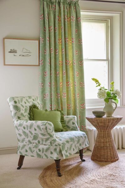
How to bring these shades into your home:
Try a Roman blind in a floral or leafy print, paired with upholstery in a light neutral to let the pattern take centre stage.
Pairs beautifully with:
Rattan, pale oak, and simple linen union fabrics for a light and airy scheme.
Our bestselling meadow green and soft white fabrics:
Cow Parsley in Moss & Cornflower, French Ticking in Moss & Cornflower, and Sunflower Detail in Light Indigo, Cloud & Moss.
4) Introduce soft pinks and berry tones
Summer blooms bring some of the season’s most vibrant and joyful colours. Shades like dusky rose, cranberry, raspberry, and damson add personality while still retaining a sense of elegance. This palette brings warmth and depth without ever overwhelming the space, making it ideal for bedrooms, dressing rooms, and sitting rooms – or any other space where you want an injection of colour.
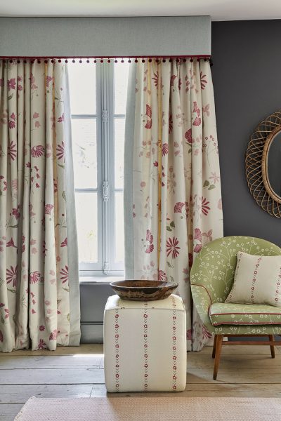
How to bring these shades into your home:
Introduce them as accents through cushions and small accessories, or as a statement fabric for blinds, curtains, or an occasional chair.
Pairs beautifully with:
Soft greys, warm neutrals, and natural linens, so that the berry tones can sing without competing.
Our bestselling soft pink and berry fabrics:
Berries and Leaves in Lily Pink & Soft Raspberry, Pretty Maids in Damson & Winter, and Sunflower in Soft Raspberry.
5) Refresh neutral schemes with sunlit yellows
Soft buttery shades (like buttercup) and sunny tones (like saffron) help to bring warmth and brightness to your neutral interiors. But they still feel gentle and easy to live with. Sunlit yellow shades add subtle definition when contrasted against a grey backdrop, allowing the warmth of the yellow to shine. This palette is perfect for kitchens, hallways, and home offices where you want a lift of brightness.
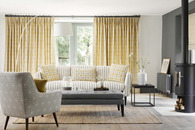
How to bring these shades into your home:
Try a set of cushions, a new Roman blind, or lightweight curtains in a cheerful yellow print to instantly brighten a room.
Pairs beautifully with:
Greys ranging from charcoal to scree for a look that feels sophisticated and timeless.
Our bestselling sunlit yellow fabrics:
By the Sea in Saffron & Charcoal, French Ticking in Buttercup & Clay, and Up the Garden Path in Saffron.
Ready to refresh your home with summer fabrics?
At Vanessa Arbuthnott Fabrics, we offer a fantastic selection of nature-inspired fabrics in warm summery tones to instantly lift your space. You can purchase your chosen fabric by the metre, or use it to create made to measure curtains, blinds, furniture, or soft furnishings.
If you’re not sure where to begin, don’t worry. Our expert interior designer, Tania, offers free virtual design consultations to help you discover which colours and fabrics will work best in your space. Book your slot today to start your summer refresh.
FAQs
What colours are trending for summer interiors in 2026?
In summer 2026, we’re seeing a clear shift towards warm, earth-rooted tones. The top 2026 summer colour palettes for interiors include terracotta and ochre, coastal blue and sandy neutrals, meadow green and soft white, and berry pink and sunlit yellow for accents.
What fabric colours work for summer home decor?
Warm terracotta and ochre suit living rooms and kitchens. Coastal blue and sandy neutrals are best for bedrooms and sitting rooms. Meadow green and soft white are ideal for kitchen and garden rooms. Berry tones or sunlit yellow work well as accents wherever you want a lift of colour.
How do I add summer colour to my living room?
Start small when adding summer colour to your living room. A cushion, Roman blind, or set of curtains in a warm terracotta or yellow print will help to bring brightness into your living room without having to redecorate. Stick to three colours in a 70:20:10 ratio and balance pattern with plain linens so the eye has somewhere to rest.
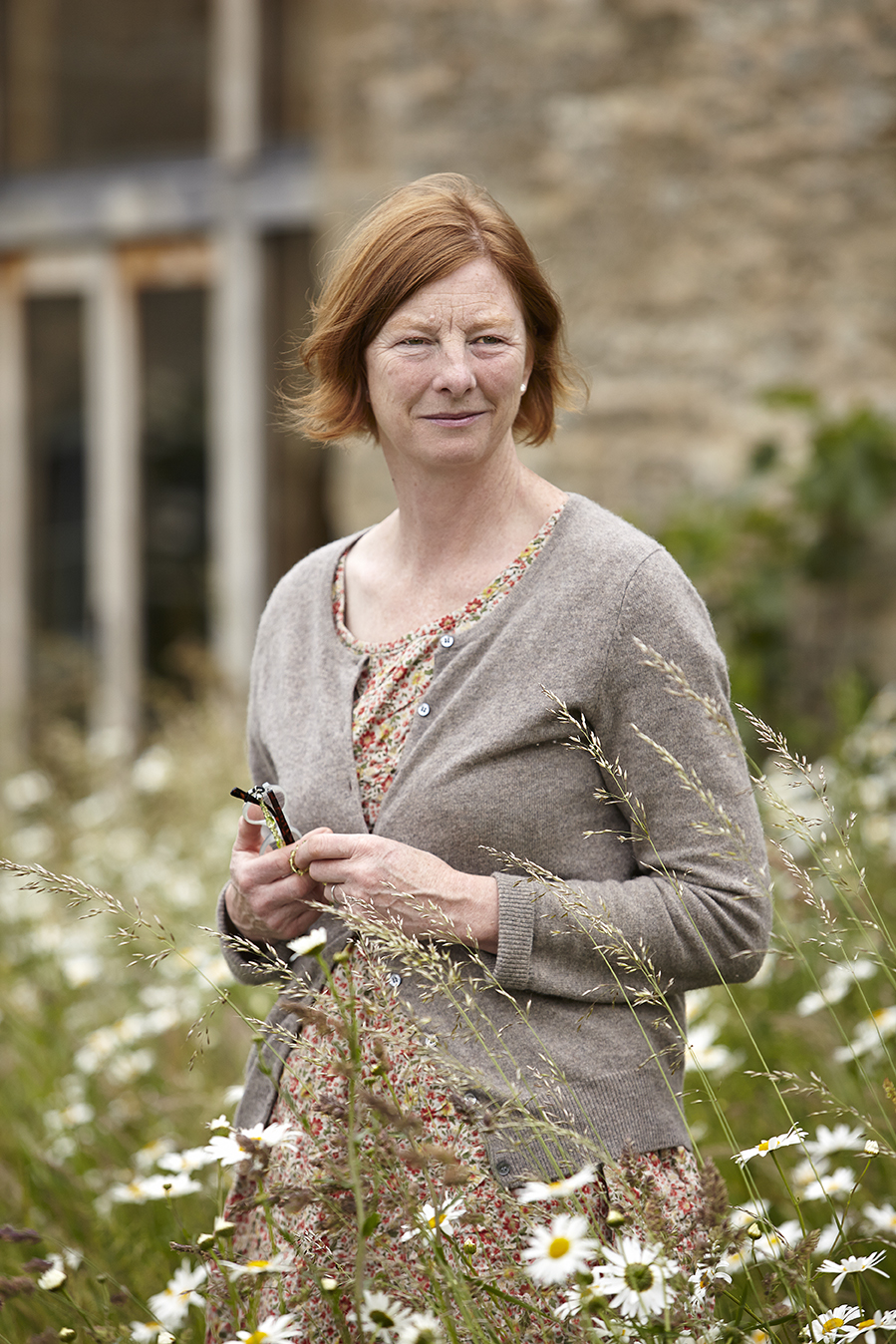
We sell fabrics exclusively designed by Vanessa Arbuthnott, along side small, bespoke collection of Made to Measure items which includes curtains, blinds, sofas, footstools, chairs, headboards, and quilts, all handmade specially for you by master crafts people.