
Decorating with Pinks
The Pinks of Spring
[ez-toc]
As blossom starts to reappear to brighten up our year, we are reminded that in an ever-changing world, nature will always be a source of comfort for many of us
Blossom is one of the first signs that spring has well and truly arrived, and is a welcome sight of colour after the frosty winter months. From the pinker hues to the cloudy white, these delicate blossoms are a joyful sight and a reminder that warmer days are on their way.
Blossom is not only beautiful to look at, it also supports a variety of wildlife. It provides a vital habitat for bees and badgers: an abundance of fauna thrives on it. Bees seek pollen from wild cherry and apple blossoms. Caterpillars and butterflies love the leaves of goat willow and elderflower blossoms. Song thrushes and blackbirds eat the fruit produced by the trees and hunt for insects among the blossom. Badgers, mice, voles and foxes eat the fruit that falls to the ground.
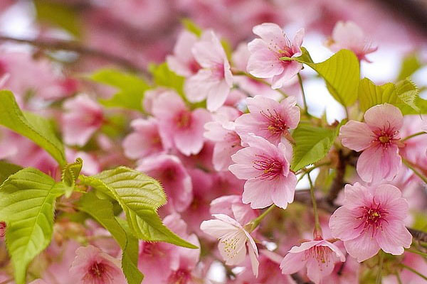
Cherry blossom: many garden varieties are of Japanese origin, known as the Sakura or Village cherries. The British Isles has just two native species: bird cherry and wild cherry or gean. Wild cherry is often seen in woodlands where its brilliant flowers light up the canopy. Cherry blossom is best seen during March, April and some varieties in May.
Decorating with Pink in our Homes
Inside our houses the colour pink represents compassion and love; it relates to understanding, and to the giving and receiving of nurturing.
Pink calms and reassures our emotional energies, alleviating feelings of anger, aggression, even resentment, abandonment and neglect…wow…the power of colour!
Red and white are enough to make a basic pink, blue or yellow can be added to make the pink more purplish or peachy and adding grey will give you more dusky pink.
In colour theory, a tint is a mixture of a colour with white, which increases lightness, while a shade is a mixture with black, which increases darkness. Meanwhile, the term tint can be generalized to refer to any lighter or darker variation of a colour.
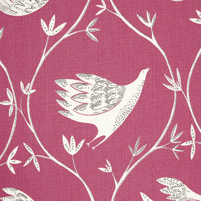
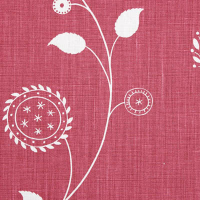
Damson
Damson is my most popular pink, it’s gentle and beautiful without being frumpy: a reddish pink reminiscent of tulips and rose campion. There are LOTS of fabric options here…I am very keen on this shade!
Damson works well with blues and greys as well as greens.
Suggested coordinating fabrics are:
Sepals and Petals – Light Kale
Berries and Leaves – Lily Pink, Mallow
Stockholm Stripe – Dove, Winter

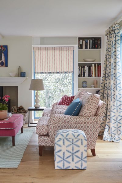
Cow Parsley / Pretty Maids / Stockholm Stripe
In Full Flight / Gypsy Garland / Fruit Garden


Lapland Stripe / Lattice Leaf / Herbaceous Border Detail
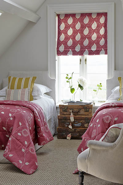
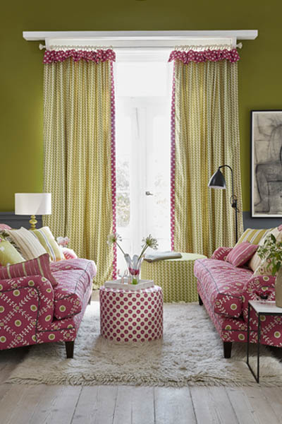


Damson pinks and greens are working seamlessly in conjuction with one another to create a perfectly balances and cohesive living space. Blue and yellows also go very well with Damson, so why not incorporate three or four colours into your room? Once you’ve narrowed your colours down to a certain pallette, the design choices are endless!
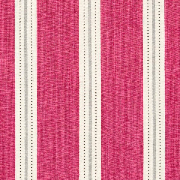
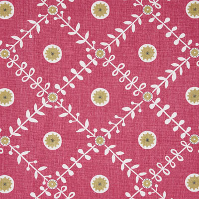
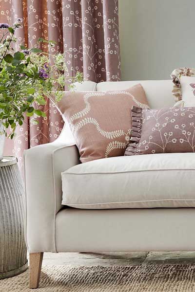
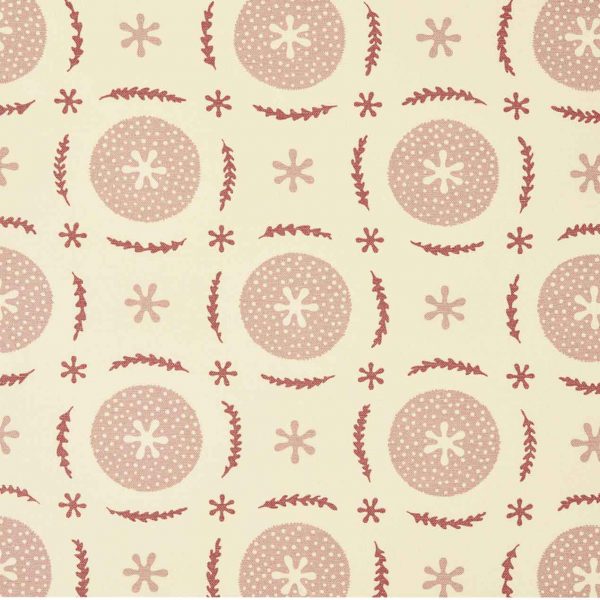
Dusky Pink
Think old damask roses and your Granny’s sitting room. There is grey in this hue of pink, making it a timeless shade with vintage sophistication!
Suggested coordinating fabrics are:
Stockholm Stripe – Whippet, Dusky Pink
Pretty Maids – Dusky Pink – Winter
Pretty Maids – Dove, Winter
Pretty Maids – Lime, Winter
Pretty Maids /Up the Garden Path

If you’re looking for that french country living feel in your home, this is ideal! The Up the Garden Path is perfect for curtains, and the Pretty Maids acts as a coordinate in this instance that you could even use on your curtains as a leading edge, flop over frill, or as a reverse lining.
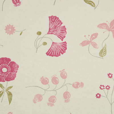
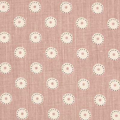
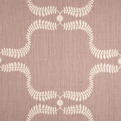
Sea pink and Lily Pink
These are pastel pinks, pretty and feminine, like the delicate flowers of cherry and apple blossom.
Here blues and greens can be used for coordinates.
Suggested Coordinating fabrics:
Simple Ticking – Kale
Simple Ticking – Forget-me-not
Pie in the Sky – Olive, Sea Pink
Plain Linen Union – Kale
Four Seasons / Herbaceous Border Detail / Wild Fern

Branching Out – Lily Pink / Berries and Leaves / Little Fern

It may not seem usual to combine Saffron yellow with pinks, bit it absolutely works! Along with Ochre and greens, Lily pink can help tone down a design in a room that may already have ‘loud’ colours in there.
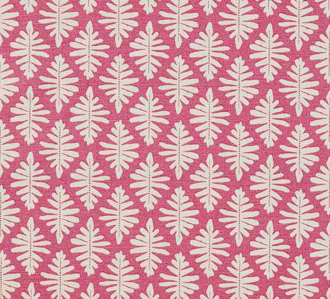
Mallow
A slightly brighter alternative to Lily Pink. A good complementary colour for this is my Moss green.
Suggested Coordinating fabrics:
Wild Fern – Soft Cornflower, Speedwell

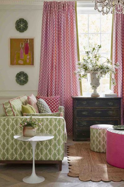

The Lattice Leaf on my Traditional Armchairs with back cushions, are the perfect accompaniment to this sitting room, mixes really well with the Indigo blues. The Little Fern curtains in Mallow, although a small pattern repeat, are gorgeous against the green sofa; look close and you can see this green is reflected on the leading edge of the curtains! Lastly, this beautiful basin skirt in Lattice Leaf. How gorgeous does it look against the Sky Blue paint from Little Greene?!
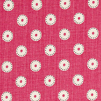
Soft Raspberry
A softer version of the bright, bolder Raspberry red, where in this has a pinker tone to it.
Suggested Coordinating fabrics:

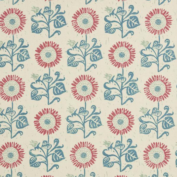

Dotty Check / Sunflower Detail / Sunflower


Simple Ticking Detail / Plain Linen Union / Dotty Check


Decorating Tips, Advice, Styles and Inspiration
Here are our design tips to help you model interiors and styles from certain colours around rooms in your home:
We sell fabrics exclusively designed by Vanessa Arbuthnott, along side small, bespoke collection of Made to Measure items which includes curtains, blinds, sofas, footstools, chairs, headboards, and quilts, all handmade specially for you by master crafts people.